

Amazon Checkout
Desktop / UI Design / User Testing

AMAZON CHECKOUT
As an Amazon-wide migration on desktop to a newer tech stack with a single page checkout was underway, my team was intentionally staying behind. Our team felt that our customers needed a dedicated page to focus on their heavy/bulky item (>50 lbs) in order to choose the best delivery service and schedule their delivery. This meant that we would stay in the current, multi-page checkout design, on the older tech stack. I was tasked with finding out if our team’s hypothesis was true, or if it would be possible to move to the new checkout experience.
OBJECTIVES
Create design solutions for both current and new checkout experiences on desktop
Conduct user testing to compare current vs. new checkout flows and recommend a route
Build out all worldwide use cases and edge cases for the proposed solution
TIMELINE
March 2021 - Sept 2021
MY ROLE
Product Designer II @ Amazon
Sketches + Wireframing
UI Design
Prototyping
Usability Testing
Design Specs + Use Cases
1. EMPATHIZE
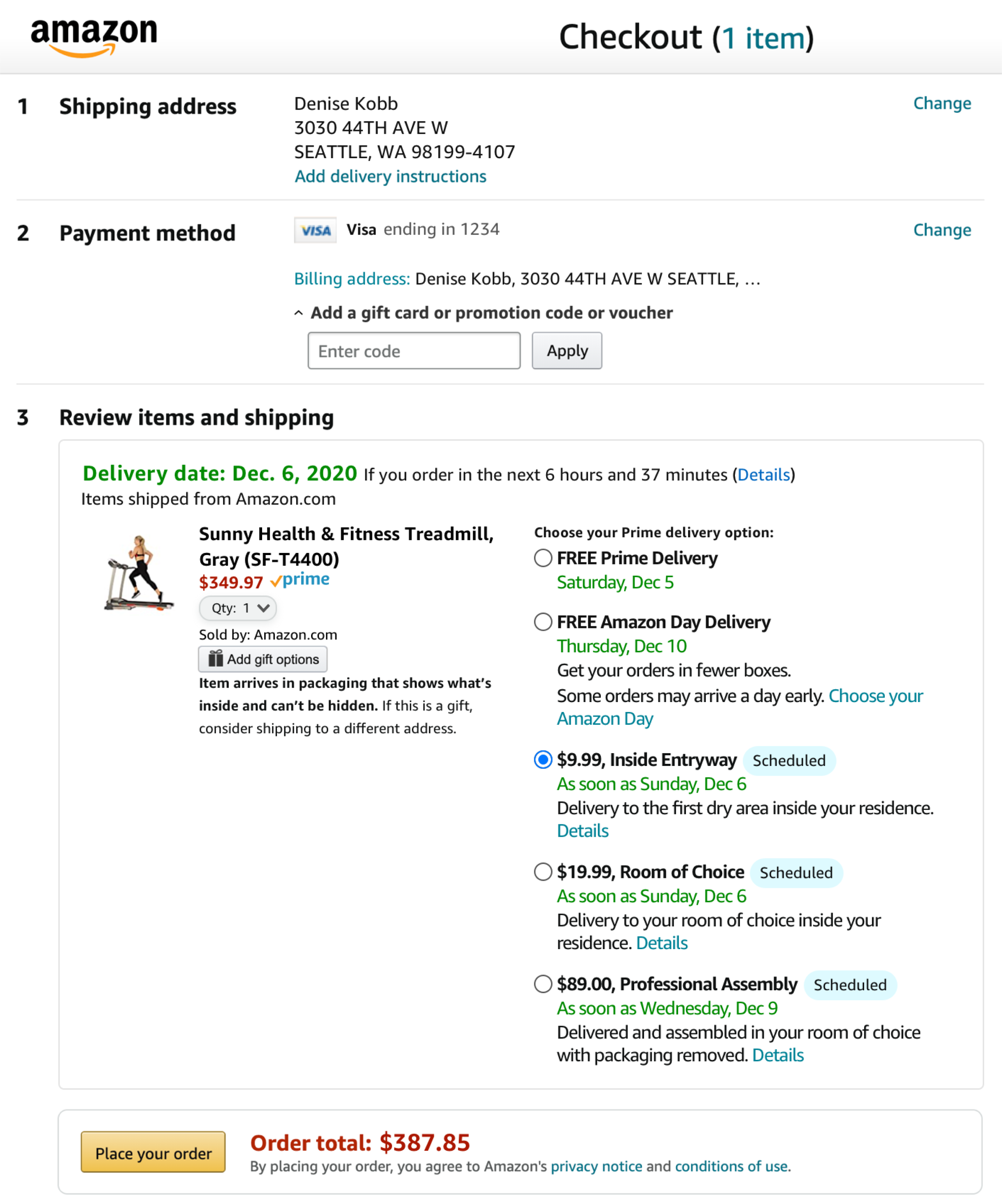
I started my process by doing some internal reviews of the current vs. new checkout experiences. The current experience took customers through a multi-page checkout flow, including a dedicated page for selecting in-home services such as installation, and scheduling a date and time slot for delivery. The newer, single page checkout collapsed all those steps into one page.
COMPETITIVE REVIEW
But what did customers expect in their checkout flow? A quick competitive analysis found similar patterns, with older, more established furniture brands like Ashley Furniture relying on multi-step checkout flows, and with newer players like Article using a single page checkout.
2. DEFINE
Next I met with stakeholders to discuss my plan for testing the two flows. We aligned that based on the feedback from customers in testing, we would make a final decision between current vs. new checkout.
TASK FLOW
I created a task flow to envision the steps the customer would take to get through checkout in the current vs. new experiences. This showed me how vastly shorter the new flow would be, and validated the need for this research, to determine if customers value a one-step-at-a-time flow or if they were able to do it all on one singe page without being overwhelmed.

3. IDEATE
Once I had identified the key task flows, screens, and features I’d need, I began sketching different ideas, followed by wireframes and polished UI designs.
UI DESIGNS
I chose a treadmill product that had in-home services as well as scheduling enabled, and created UI designs for our current checkout flow, as well as the new single page checkout.


4. TEST
USER TESTING
I designed a research plan, wrote a test script, and launched 3 rounds of testing on UserTesting, with a total of 60 participants. Then I synthesized results in a report with recommendations that I shared with my organization.
Insights:
Both versions of checkout are optimized for speed and defaults (address, payment method, delivery method). Both groups considered their experience as a “typical amazon checkout process”, with largely positive overall feedback
The service scheduling feature made sense once discovered
There were similar shopping patterns in both groups: 1) skimming the page without fully reading or ingesting it, looking only for things like prime or free delivery, 2) tendency to just look for the yellow buttons (primary CTA) and click through quickly, and 3) relying on the defaults that were already selected
Part of the team’s original hypothesis was true - that people do need dedicated space to focus on service selection and scheduling. However, nothing observed or noted worse in the newer single page checkout vs the current multi-step checkout. We saw the same type of shopping behavior - neither solution provides customers with focus
The current multi-page checkout was tuned out/passed by quicker, while customers spent more time with the new single page checkout, but the page was crowded and would need to be optimized for heavy bulky items

“I am so familiar with Amazon’s checkout process that there are things I always look for, and things I just skim over.”

“I'm realizing I ordered too quickly and didn't see all the options for delivery. Perhaps, it would be helpful to have pop up window to confirm any deliveries that are outside the normal expectation of Amazon deliveries.”

“I just went for Amazon Prime, like usual, without a lot of thought.”
5. ITERATE
Based on the findings from user testing, I recommended that we migrate to the new tech stack and move to the new single page checkout. However, I knew the page needed to be optimized to work for heavy bulky customers, to provide some more clarity and focus for them to consider services before placing their order.
EARLY V2 IDEAS
After conducting more internal and competitive reviews and sketching ideas, I created new ideas for heavy bulky items on the new single page checkout. I felt it was crucial to add a new, dedicated step for the service selection and scheduling to the page.


HIGH FIDELITY V2
I narrowed it down to three distinct treatments I wanted to test and I met with the Amazon Checkout team for a design review. I received their approval to add our own unique step to checkout for heavy bulky items just for service selection and delivery scheduling.


7. TEST AGAIN
USER TESTING
I designed a research plan, wrote a test script, launched on UserTesting with a total of 30 participants. I synthesized results in a report with recommendations that I shared with my organization.
Insights:
All three designs tested positively, and were a big improvement from the typical single page checkout experience that we had tested previously. This resulted in a high judgement call on which design to move forward with. I recommended going with Option 2 for the following reasons:
testers were more engaged with this design, spending more time on the page digesting the information, and were more likely to choose scheduled delivery
this concept included a visual of the package dimensions and weight, which was helpful in making their delivery service decision
it was the most readable, understandable, and usable option, especially with radio buttons on the left side, which was easy to scan. Plus it had the best use of whitespace on the page
it would be easier to carry over patterns into mobile if needed
the normal calendar is an existing mental model for customers to select dates
this concept is scalable to different use cases and marketplaces

“This is very familiar for anyone who has used Amazon before...this all makes sense to me and I’m ready to place my order.”

“I can’t imagine how it could be much shorter and still be effective, but if it was any longer I would have been annoyed.”
8. ITERATE
While creating the final mocks, I incorporated the feedback I received from customers in the last round of user testing, updating UI, and spent time building out all necessary use cases.
USE CASES
I spent a lot of time creating mocks for all our worldwide marketplaces, working closely with developers and international product teams, accounting for any unique or especially complex use cases, other product types, and unhappy paths.


MOBILE MOCKS
Even though mobile had already migrated to a single page checkout experience, and this project focused primarily on desktop, I wanted to mock up similar experiences on mobile to see if there were any learnings or updates we’d want to carry over to mobile devices as well, to create more consistency between the two experiences.


COMPONENT CREATION
I noticed our calendar and time slot buttons were not compliant with Amazon’s new Rio design system, so I created some explorations for a new component in partnership with the design system team.
FINAL MOCKS
I did some final reviews with the Checkout team gain approvals before we moved toward implementation and finalized the mocks for my proposal to move heavy bulky items to the new, single page checkout on desktop.


REFLECTION
This was the most self-directed and lengthy design process I have been a part of, with endless iterations and 6 prototypes/user tests. It almost started as a philosophical question on our team about which direction we should go, and it was really gratifying to build a strong design POV and recommendations as I learned from customers through testing.